Contents
This document defines how Yotta looks, sounds and behaves. It is the single source of truth for anyone producing work in the brand's name.
Sections 01–07 are approved and locked. Section 08 carries placeholders where final mockups are still to be produced.
Read this first
Yotta is not a look. It is a system of measurement applied to experience. Every decision in this book comes back to one idea: a drink is a unit, and a unit can be measured.
If a design is beautiful but says nothing about measurement, it is not Yotta yet.
Colour values, type sizes, clear space and ratios in this book are not suggestions. Deviations need written approval.
The system is editorial. One idea per surface, generous space, quiet ink, one moment of green.
Arabic and English are set as one lockup, at matched optical weight, in every market-facing asset.
Any attribute of an experience can be expressed in YU. That is the brand's escape hatch and its signature.
Strategy
The thinking that everything else answers to — what Yotta is for, who it is for, and the proprietary system that makes it impossible to imitate.
- Brand idea & essence
- Purpose, vision, mission
- Positioning & promise
- Audience
- Personality & archetypes
- Brand pillars
- The Yotta Units system
Measure the Moment.
Yotta turns a drink into a unit of experience. The brand is not about what you drink. It is about how much experience fits into every sip.
Experience, Measured.
The shortest true statement of what Yotta is.
Every drink delivers something worth measuring.
What a customer is entitled to expect, every visit.
Taste × Measurement × Modern Lifestyle
Taste is the product. Measurement is the difference. Lifestyle is the relevance.
To turn everyday drinking rituals into small, memorable experiences.
To be recognised not only by what we serve, but by the world, language and rituals around every drink.
Craft drinks and experiences where flavour, quality, presentation and atmosphere meet in one measurable Yotta moment.
Crafted Drinks × Distinctive Experience × Contemporary Culture × Ownable Brand Language
Yotta does not compete on ingredients or menu length. It competes by owning a system around the consumption experience itself.
For people who see drinks as part of their lifestyle rather than simply refreshment, Yotta is a contemporary beverage brand that transforms every sip into an experience — combining crafted flavour, modern culture and playful measurement through the world of Yotta Units.
- Quality drinks
- Recognisable recipes
- Consistent experience
- Convenient consumption
- Easy-to-explore menu
- Thoughtful combinations
- Discovery
- Pleasure
- Energy
- Curiosity
- Self-expression
- Belonging
Most competitors win on either craft or aesthetics. Yotta claims the empty quadrant: a proprietary language that makes craft legible and shareable.
Who we are for
Socially active, design-aware young adults who discover places visually and treat a drink as a small lifestyle moment.
Finds places through Instagram and Snapchat before ever walking in. Orders what photographs well, returns for what tasted right. Wants to be first to show friends something new.
What Yotta gives them: a drink with a code and a score — content that is built in, not staged.
Comes three to five times a week. Cares about consistency, speed and being recognised. Has one order and one variation of it.
What Yotta gives them: a personal reading — their usual expressed in units they can adjust.
Chooses the venue for others. Judged on the choice. Wants somewhere that signals taste without effort or explanation.
What Yotta gives them: a room and a menu that do the talking.
Curious · Precise · Contemporary · Playful · Confident · Cultured
The governing tensionPrecision × Playfulness
Yotta lives between a modern laboratory and a contemporary lifestyle brand. Both halves are required. Either one alone breaks the brand.
Experimentation, craft, combination, originality. Yotta creates rather than serves.
Discovery, curiosity, new flavours, the unexpected.
A light layer for campaigns and social only. Never the core.
Five pillars
Every initiative should ladder to at least one. Anything that ladders to none does not get made.
Every Yotta Unit starts with attention to ingredients, combinations and preparation.
ProofRecipe cards, barista training, ingredient callouts on menu.
Yotta brings precision and intentionality into the drinking experience.
ProofYU readings on every product, exact specs, consistent pours.
New flavours, combinations and experiences are part of the culture.
ProofSeasonal Experimental Units, limited codes, tasting drops.
Yotta exists around conversation, movement, meetings and everyday moments.
ProofRoom design, shareable formats, @Yotta_sa content.
Your drink can reflect your mood, energy and personality.
ProofCustomisable units, mood-led ordering, personal readings.
Yotta Units
YU
The strongest thing Yotta owns. Not a tagline device — a complete communication system that runs from packaging to loyalty.
YU are not scientific measurements. They are Yotta's interpretation of an experience. They are always whole numbers, always suffixed YU, and never explained apologetically.
A YU reading is a claim about experience, never about nutrition, caffeine content or health. Never present YU as a medical or dietary figure.
Strawberry / Lime / Mint
- Freshness
- Sweetness
- Energy
- Intensity
- Chill
Use three to five per product. Never invent a sixth without approval.
- 92 YU — reading
- +80 YU — gain
- YOTTA 042 — product code
- FLAVOR / 089 — annotation
- Off the scale — max
Purchases generate units. Loyalty is never described in "points". The word is always units.
The signature question. Used at the counter, on cups, in captions and in campaigns. It invites a reply, which is the point.
Where the system reachesThe goal is not another attractive beverage brand. It is to make Yotta Units an ownable language — the thing competitors cannot copy without becoming imitators in public.
Verbal Identity
How Yotta speaks — the slogan, the tone, the vocabulary, and the naming system that turns a menu into a brand world.
- Slogan & brand lines
- Tone of voice
- Sample language
- Product naming
- Menu architecture
Every Sip in Yotta Units.
More than a campaign line. It introduces the system behind the entire brand. Every drink, every flavour, every mood, every moment — measured in Yotta Units.
- Set in sentence case with a full stop. Never all caps.
- Never translated loosely. Approved Arabic: كل رشفة بوحدات يوتا
- Never locked into the logo as a permanent tagline lockup.
- Minimum clear space above and below: one cap height.
- On packaging it may appear as Every sip in Yotta units in sentence case, as currently printed.
Short, confident statements.
Yotta writes the way a good barista talks: quickly, precisely, without performance.
We areSmart · Concise · Playful · Contemporary · Curious · Slightly experimental
Four principlesIf it needs a paragraph, it is not ready.
A reading is more persuasive than an adjective.
Wit comes from precision, not from jokes.
No hard sell, no exclamation marks, no begging for follows.
- Today's reading: 92 YU.
- Cold. Bright. Off the scale.
- New unit in store.
- Three ingredients. One number.
- We are passionate about coffee.
- An explosion of flavour!
- Indulge in pure luxury.
- No cap, this hits different.
- A journey for the senses.
Corporate language · generic beverage clichés · excessive luxury language · overly emotional coffee poetry · forced slang · exclamation marks · the words indulge, journey, passion, artisanal, elevate.
Codes, not adjectives.
Products are named by number and described by ingredients. The number is the identity; the ingredients are the information.
StructureCodes are three digits, always zero-padded, assigned sequentially and never reused. Retired codes stay retired.
| Range | Family | Notes |
|---|---|---|
| 001–099 | Core hot | Espresso-based and permanent |
| 100–199 | Core cold | Iced, brewed cold, permanent |
| 200–299 | Fresh & fruit | Juices, sodas, refreshers |
| 300–399 | Calm | Milk-forward, teas, low intensity |
| 400–499 | Sweet | Dessert-inspired |
| 900–999 | Experimental | Seasonal, limited, dated on release |
Never name a product with a person's name, a place name, or a size word. "Large Strawberry" is not a Yotta product name. YOTTA 042 · Strawberry / Lime / Mint is.
Five unit families
The menu is organised by what a drink does to you, not by how it is made. Brewing method belongs in the description, never in the category.
Built around energy and intensity. Espresso-forward, high caffeine, high YU intensity readings.
Bright and refreshing. Citrus, fruit, sparkling, iced tea. High freshness readings.
Smooth and relaxing. Milk-forward, low intensity, warm spice, herbal.
Dessert-inspired combinations. High sweetness readings, treated as an occasion.
Seasonal, unusual and limited edition. Dated on release, retired without ceremony.
Logo
The bilingual wordmark, its variants, and the rules that keep it consistent at every size and on every surface.
- The lockup
- Variants
- Clear space & minimum size
- Colourways
- Misuse
One mark, two scripts.
The primary lockup sets the Latin and Arabic wordmarks side by side at matched optical weight. Neither script is a translation of the other — together they are the mark.
Construction notes- Extra-light monolinear letterforms with open counters and flat terminals.
- The V-cut apex of the Y and the angled A are proprietary — never substitute a typeface.
- Two rotated squares carry the Arabic diacritic and repeat as the brand's smallest graphic unit.
- Latin and Arabic sit on a shared optical baseline with a fixed gap of 0.42 × cap height.
The logo is supplied artwork. It is never re-typed, re-spaced, re-weighted or rebuilt from a font.
Default for all brand-level applications: packaging, signage, menus, stationery, campaign endframes.
For English-only contexts, export markets, and lockups where the Arabic would fall below minimum size.
For Arabic-first contexts, local campaigns and surfaces where the bilingual lockup would crowd.
- Bilingual lockup wherever space allows.
- Single-script lockups only when the bilingual mark cannot meet its minimum size or clear space.
- Never place the Latin and Arabic marks separately on the same surface to imitate the lockup.
- SVG — screen, web, digital signage
- AI / EPS — print and large format
- PNG on transparent — presentations only
- Single-colour versions of every variant
No type, image, rule, edge or graphic element may enter the X zone on any side. On packaging the zone is measured from the trim edge, not the fold.
| Variant | Screen | |
|---|---|---|
| Bilingual lockup | 32 mm wide | 150 px wide |
| Latin only | 20 mm wide | 96 px wide |
| Arabic only | 16 mm wide | 72 px wide |
| Diacritic unit (graphic) | 2 mm | 8 px |
The wordmark is extra-light. Below these sizes the strokes break up in print and disappear on screen. If the space is smaller, use the Latin-only mark — never a bolder redraw.
For stitched, etched or debossed reproduction, use the supplied Heavy Reproduction artwork, which thickens strokes by 18% to survive the process. Request it from brand@yotta.sa — never thicken the standard file yourself.
Primary. Default for packaging and print.
Night, premium and campaign contexts.
Green surfaces only. Never Off-White on green.
Only over even, dark areas. Never over busy detail.
- The mark is always a single flat colour. No gradients, no two-tone lockups.
- Minimum contrast against its background: 4.5:1.
- Off-White on Yotta Green measures 1.91:1 and is prohibited.
- On photography, place the mark over a region with less than 15% tonal variation.
- Graphite #606060
- Ink Black #1A1A1A
- Off-White #F5F7F7
- Deep Olive #687435 — accent use only, never as default
Never do this
This list is illustrative, not exhaustive. Any modification of the supplied artwork is misuse.
Colour
A deliberately narrow palette. Off-white does the work, graphite carries the words, and one green does all the remembering.
- Primary palette
- Extended palette & tints
- Ratios & accessibility
| RGB | 245 · 247 · 247 |
| CMYK | 1 · 0 · 0 · 3 |
The ground. Every surface starts here. Carries the speckle texture.
| RGB | 175 · 188 · 105 |
| CMYK | 7 · 0 · 44 · 26 |
The brand asset. Panels, patterns, one moment per surface. Never body text.
| RGB | 96 · 96 · 96 |
| CMYK | 0 · 0 · 0 · 62 |
The logo ink and secondary text. Quiet, never harsh.
| RGB | 26 · 26 · 26 |
| CMYK | 0 · 0 · 0 · 90 |
Primary text, headlines, night surfaces, maximum contrast.
- Yotta Green nearest match: Pantone 2302 C — confirm on stock before any print run.
- On uncoated and kraft stock, print green at 100% with no screen; it drops two steps in saturation.
- Off-White is a printed colour, not paper white. On white stock it must be laid down as a flood.
Green is a surface, not a voice. It fills panels, patterns and blocks. It does not set sentences on light grounds — it fails contrast at 1.91:1. When green must be read as text, use Deep Olive.
| RGB | 104 · 116 · 53 |
| CMYK | 10 · 0 · 54 · 55 |
Green as text. The only approved green for type on light grounds. 4.72:1.
| RGB | 214 · 221 · 179 |
| CMYK | 3 · 0 · 19 · 13 |
Tint for backgrounds, table stripes, secondary panels.
| RGB | 231 · 235 · 206 |
| CMYK | 2 · 0 · 12 · 8 |
Lightest tint. Highlight blocks, note boxes, hover states.
| RGB | 237 · 239 · 239 |
| CMYK | 1 · 0 · 0 · 6 |
Secondary ground. Cards and panels that sit on Off-White.
Only these five steps exist. Do not generate intermediate tints.
- Any second accent colour. The palette has one.
- Gradients of any kind, including on green.
- Pure black #000000 and pure white #FFFFFF.
- Warm greys, beiges or kraft tones as digital colours — kraft appears only as a material.
Green never exceeds a quarter of any surface. If a layout needs more green to feel like Yotta, the layout is wrong — add measurement graphics instead.
For evening, premium and campaign work the ratio inverts: 70% Ink Black, 18% Off-White, 12% Green. The green value does not change.
| Foreground | Background | Ratio | Verdict |
|---|---|---|---|
| Ink Black | Off-White | 16.19:1 | AAA · any size |
| Graphite | Off-White | 5.85:1 | AA · any size |
| Deep Olive | Off-White | 4.72:1 | AA · any size |
| Ink Black | Yotta Green | 8.47:1 | AAA · any size |
| Off-White | Ink Black | 16.19:1 | AAA · any size |
| Graphite | Yotta Green | 3.06:1 | Large text only ≥ 24px |
| Yotta Green | Off-White | 1.91:1 | Prohibited for text |
| Off-White | Yotta Green | 1.91:1 | Prohibited for text |
Digital products must meet AA at minimum. Packaging and signage should meet AA for any text a customer needs to read to make a decision — ingredients, prices, allergens.
Typography
Two families, set light and wide. Red Hat Display carries the Latin, Vazirmatn carries the Arabic, and they are always set as equals.
- Typefaces
- Scale & specification
- Bilingual setting
0123456789 / +YU
Open source, SIL Open Font License. Licensed for print, web, app and packaging with no royalty. Weights above are the only approved set — never use Black, ExtraBold or the italics.
٠١٢٣٤٥٦٧٨٩
Vazirmatn ExtraLight (200) is the default Arabic weight, chosen to match the extra-light logo. Regular 400 is permitted only below 12 px / 9 pt where ExtraLight loses legibility.
System fallback stack: Red Hat Display → Helvetica Neue → Arial. Vazirmatn → Segoe UI → Tahoma. Never substitute a different display face for the wordmark, which is artwork, not type.
| Style | Use | Screen px / line / tracking | Print pt / leading | Weight |
|---|---|---|---|---|
| Display XL | Covers, campaign statements | 64 / 1.02 / −0.02em | 48 / 49 | Light 300 |
| Display | Section openers | 44 / 1.06 / −0.015em | 32 / 34 | Light 300 |
| Heading 1 | Page titles | 32 / 1.15 / −0.01em | 22 / 25 | Light 300 |
| Heading 2 | Sub-sections | 22 / 1.25 / 0 | 15 / 18 | Medium 500 |
| Lead | Intro paragraphs | 18 / 1.55 / 0 | 12 / 16 | Regular 400 |
| Body | Running copy | 15 / 1.65 / 0 | 9.5 / 14 | Regular 400 |
| Small | Captions, notes | 13 / 1.5 / 0 | 8 / 11 | Regular 400 |
| Label | Eyebrows, categories | 11 / 1.4 / 0.18em · UPPER | 6.5 / 9 · 180 track | Medium 500 |
| Reading | YU values, codes | 15 / 1.2 / 0.06em · tabular | 9.5 / 12 | Medium 500 |
- Maximum 68 characters per line in Latin, 55 in Arabic.
- Never justify. Latin ranges left, Arabic ranges right.
- No letter-spacing on body copy. Tracking is for labels only.
- Headlines never exceed three lines.
- YU readings and prices use tabular lining figures so columns align.
- Product codes are always three digits, zero-padded: 042, never 42.
- Arabic-Indic numerals ٠١٢٣ may be used in Arabic-only compositions; never mix the two systems in one block.
Arabic is not a translation layer. In every bilingual composition the two scripts are set at matched optical weight and given equal space.
Arabic set 8–12% larger in point size than the Latin to equalise apparent size. Shared centre axis.
Arabic reduced and placed second — reads as a subtitle. Never do this.
- Optical size: set Vazirmatn 8–12% larger than Red Hat Display at the same rank.
- Order: in Saudi-facing work Arabic leads — top, or right in a horizontal pair.
- Direction: full RTL layouts mirror the grid, including the position of the logo and page numbers.
- Never stretch, condense or fake-bold Arabic. Never break Arabic letterforms apart for effect.
- Never set Arabic in all caps — it does not exist. Use weight and size for emphasis.
- Punctuation: use Arabic comma ، and question mark ؟ in Arabic copy.
The bilingual lockup already resolves this at brand level. Body copy on pack follows the same rule: Arabic first, matched weight, never smaller than 6.5 pt.
Graphic System
Where the measurement idea lives. The logo stays quiet; the graphics do the talking.
- The Unit Grid
- Speckle texture
- YU data blocks
- Grid & layout
The Unit Grid.
Yotta's primary pattern. It is not decoration and not a ruler — it is the TT of the wordmark, repeated without end. One letterform becomes one unit; countless units become a yotta.
Why it worksThe pattern carries the brand idea without a single word. It is drawn from the logo, so it is unmistakably ours and cannot be replicated by a competitor without copying the wordmark itself.
Construction · master artwork| Element | Specification |
|---|---|
| Unit cell | 33.27 × 22.68 units · ratio 1.467 : 1 |
| Master tile | 13 cells wide × 20 cells tall (432.52 × 453.54) |
| Cell content | One major T, one minor T nested at 54.5% width |
| Stem weight | 3.5 units · 10.5% of cell width |
| Bracket rule | 0.59 units — never thickened, never removed |
| Alignment | Cells align edge to edge. No gutter, no offset, no brick stagger. |
Use the supplied master tile. Never rebuild the pattern by typing the letter T, and never rotate it off the vertical.
Primary. Packaging side panels, environment bands.
Print collateral, menus, stationery. Quiet register.
Night, campaign and premium surfaces.
| Application | Cell width |
|---|---|
| Storefront band, wall graphic | Large · 20–40 mm |
| Packaging side panel | Standard · 6 mm |
| Cup sleeve, drip box | Standard · 4 mm |
| Menu, stationery, endpapers | Fine · 3 mm |
| Social, digital | Standard · 48 px |
- The pattern bleeds off at least two edges. It is never a floating rectangle with visible borders on all sides.
- Never screened back, never at reduced opacity, never gradient-faded.
- Never overlaid with type. Copy sits beside the panel, not on it.
- Never stretched — the 1.467 : 1 cell ratio is fixed.
- One pattern panel per surface.
Speckle and the Unit Grid never share a surface. Speckle belongs to Off-White grounds; the Unit Grid belongs to green and ink panels.
The speckle is a recycled-paper texture laid over Off-White grounds. It gives the brand a material feel without adding a colour.
| Property | Specification |
|---|---|
| Base colour | Off-White #F5F7F7 |
| Fleck colours | Graphite & Deep Olive, 30–70% opacity |
| Density | Approx. 5 flecks per cm² · never uniform |
| Fleck size | 0.15–0.5 mm |
| Tile | Seamless 70 × 70 mm — rotate 90° between panels to avoid visible repeat |
| Never | Over green · over photography · behind body copy below 9 pt |
Where budget allows, achieve the speckle with the stock itself — a recycled uncoated board — rather than printing it. Printed speckle is the fallback, not the ambition.
Bar height 4 px / 1 mm. Track in Green 40, fill in Yotta Green on light grounds and Off-White on Ink. Label ranges left, value ranges right, both in Medium 500.
- The Unit Grid at all three scales
- Coordinates and grid references
- Ratios and oversized numerals
- Technical annotations
- Ingredient codes and unit labels
- Data-inspired compositions
The result should feel designed and editorial — never like engineering software. No wireframe boxes, no crosshairs, no fake UI, no monospace terminal aesthetic.
One data block per surface. It sits in the lower third, ranged to the grid, never centred, never overlapping the logo's clear space.
| Format | Margin | Columns | Gutter |
|---|---|---|---|
| A4 portrait | 18 mm | 12 | 5 mm |
| A4 landscape | 18 / 20 mm | 12 | 5 mm |
| Packaging panel | 8% of panel width | 6 | 4 mm |
| Cup wrap | 10 mm | 4 | 4 mm |
| Social 1080² | 72 px | 6 | 24 px |
| Web | Fluid, max 1320 px | 12 | 24 px |
- One idea per surface. If there are two, make two surfaces.
- Anchor content to the top-left or bottom-left. Centring is reserved for the logo and the slogan.
- Leave at least 40% of any surface empty.
- Green panels are full-bleed on at least one edge.
Art Direction
Photography keeps the brand human. Without it, measurement reads as cold.
- Subject & framing
- Light & colour treatment
- Do & don't
The drink, shot close, straight on or from directly above. One product, one surface, honest colour. This is the hero.
Hands, tables, movement, half-finished drinks. Real people, mid-gesture, never posed toward camera.
Architecture and light. Wide, quiet, few people. Used sparingly and never as a hero.
| Light | Daylight or single soft source. Visible, directional shadow. |
| Colour | Neutral to slightly cool. Greens true, never boosted. |
| Contrast | Medium. Blacks lifted slightly, highlights held. |
| Grain | Light, film-like, optional. Never heavy. |
| Crop | Generous. Let the subject sit off-centre against space. |
- Real light and real shadow
- Off-white, stone, pale wood and glass surfaces
- Condensation, crumbs, a used cup — evidence of use
- Negative space for type and YU readings
- People whose backs and hands tell the story
- Stock imagery of smiling groups holding cups
- Heavy filters, teal-orange grading, HDR
- Latte art as the sole subject
- Props that clutter — books, plants, laptops staged
- Green backgrounds — green belongs to the graphics
If the photograph would look identical with another brand's logo on it, it is not Yotta photography. Space for a reading is what makes it ours.
Applications
Final artwork for every packaging item, one design per page, with the panel architecture and type sizes that make each one reproducible.
- Bean box
- Drip box
- Coffee box 1 L
- Large carton
- Cup wrap
- Sleeve
- Menu
- Environment
- Social
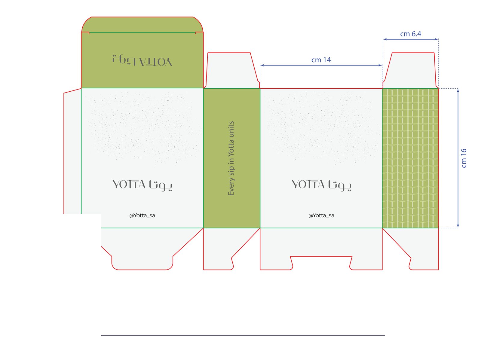
| Panel | Content |
|---|---|
| Front | As supplied: speckled ground, bilingual lockup on the optical middle, handle beneath |
| Back | Repeat of the front — identical artwork, no variation |
| Side A | Flood green, slogan set vertical, bottom-to-top |
| Side B | Unit Grid, Standard 6 mm cell, full bleed |
| Top flap | Flood green, lockup reversed in Off-White |
| Base | Legal, net weight, roast date, barcode, FSC |
The supplied artwork carries the mark and nothing else. Add the product code top-right, origin beneath the lockup, and a three-line YU block above the handle — that is what turns a branded box into a Yotta unit. Minimum type on pack 6.5 pt.
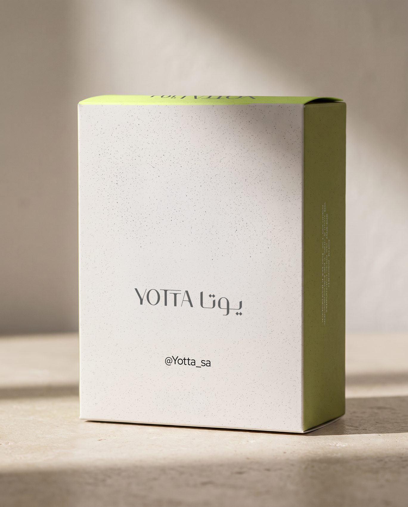
Stock and space do the work.
Matt uncoated recycled board, no coating, no gloss. The green side panel is the only saturated surface on the pack — everything else is paper and air.
Note the reading order at arm's length: mark, then green, then detail. If any pack reverses that order, the layout is wrong.

| Element | Treatment |
|---|---|
| Lockup | Scaled up proportionally — 62 mm reference on a narrower panel |
| Unit Grid | Reduced to a 4 mm cell so the pattern still reads on a 55 mm panel |
| Front artwork | Lockup and handle only, as supplied. Code and YU block to be added |
| Sachets | Off-White, lockup only, no speckle, no YU block |
The sachet is the one place the system runs bare. A single-serve item carries the mark and nothing else — the box has already told the story.
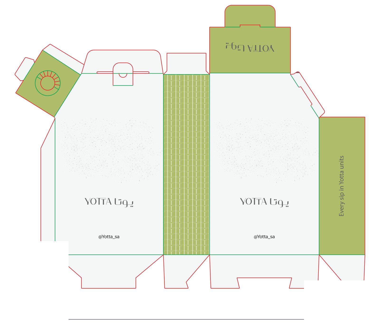
| Element | Treatment |
|---|---|
| Lockup | Held to a fixed reference — the mark never grows with the pack |
| Unit Grid | Large scale, 14 mm cell, so the letterform reads at arm's length |
| YU block | To be added. Chill and Intensity lead — a cold product must read cold on shelf |
| Base | Volume, ingredients, keep-refrigerated, expiry, barcode, importer |
At two metres the reading order must be lockup → green panel → code. If the pattern wins first, drop the Unit Grid one scale step.
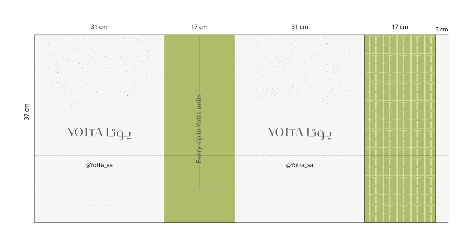
| Panel | Width | Treatment |
|---|---|---|
| Face A | 31 cm | Speckled Off-White, lockup centred, handle beneath |
| Side A | 17 cm | Flood green, slogan vertical |
| Face B | 31 cm | Speckled Off-White, repeat of Face A |
| Side B | 17 cm | Unit Grid, Large scale, full bleed |
| Glue flap | 3 cm | Unprinted |
At 37 cm tall this is the largest surface in the range. The lockup stays at the same optical weight as the bean box — the extra space becomes silence, not a bigger logo.
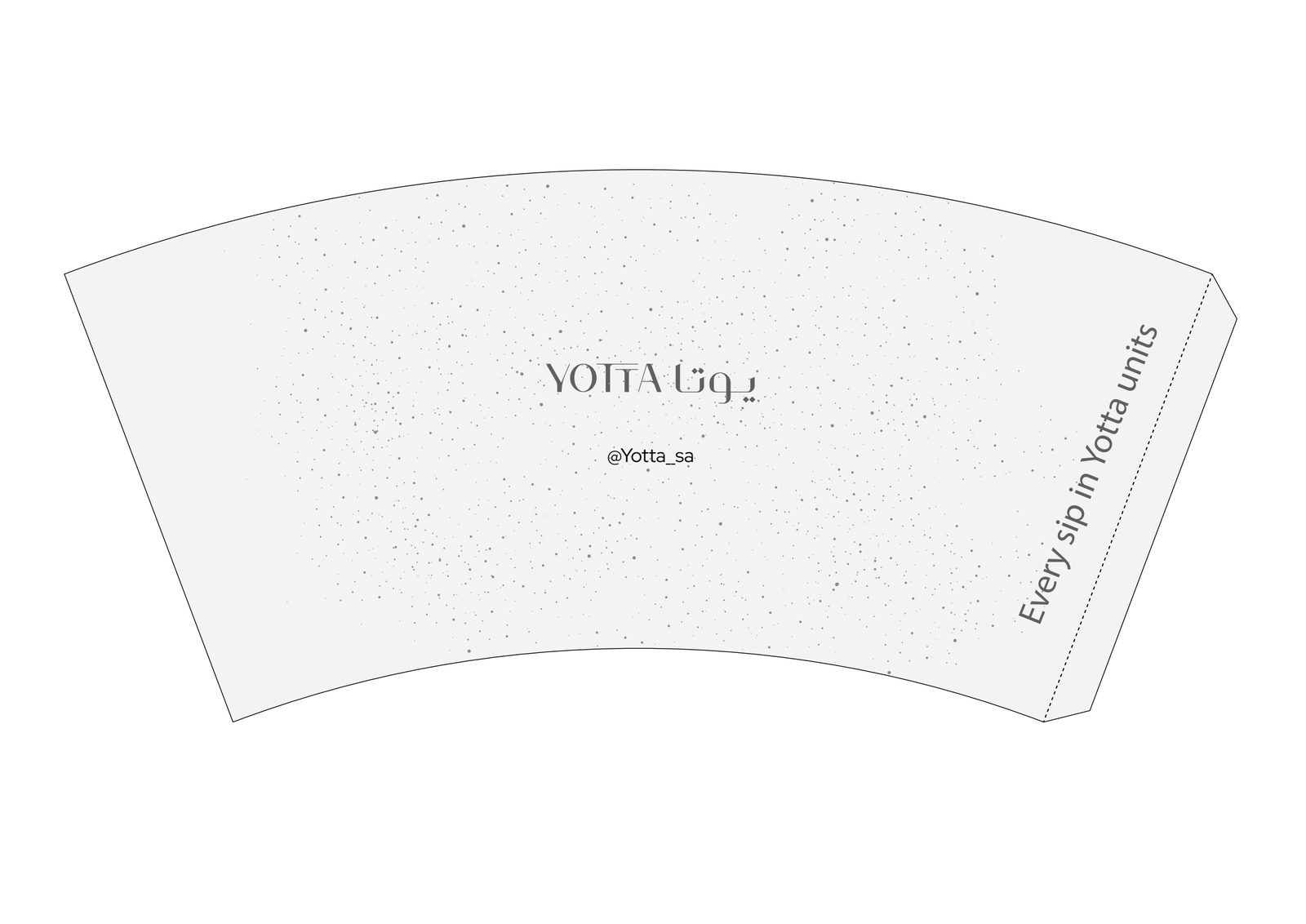
| Element | Placement |
|---|---|
| Lockup | Centred on the front face, 55% of cup height from the base |
| Handle | @Yotta_sa centred beneath, Label size, Graphite |
| Slogan | Vertical along the seam edge, reading bottom-to-top |
| Ground | Speckled Off-White across the full wrap |
| Green | None on the cup body — lid, sleeve and carrier only |
| Size | Volume | Lockup width |
|---|---|---|
| 4 oz | 118 ml | 44 mm |
| 7 oz | 207 ml | 58 mm |
| 8 oz | 236 ml | 66 mm |
| 12 oz | 354 ml | 78 mm |
Limited editions may replace the speckle with a full green Unit Grid wrap — once per season, six weeks maximum.
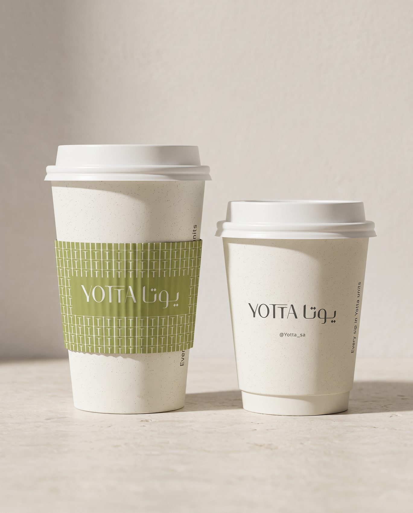
Green enters on the sleeve, not the cup.
The cup body stays bare — speckled Off-White, the mark, the handle, and the slogan running up the seam. The sleeve carries the Unit Grid, with the lockup sitting on a solid green plate.
Two sizes shown: 12 oz with sleeve, 8 oz without. The lockup grows with the cup; nothing else changes.
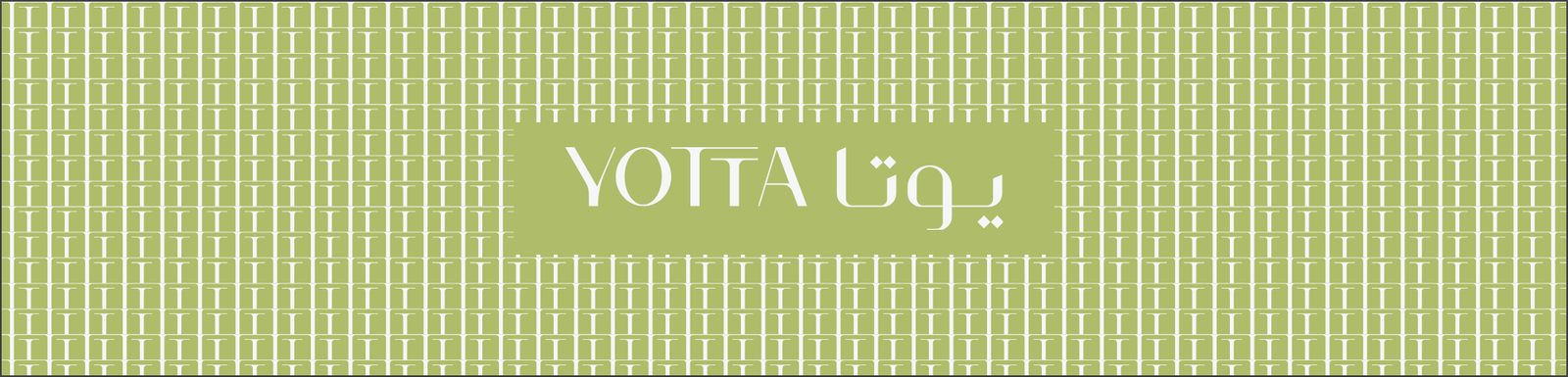
| Element | Specification |
|---|---|
| Ground | Flood Yotta Green with the Unit Grid in Off-White, Standard 6 mm |
| Mark | Off-White lockup on a solid green plate — the pattern never sits behind type |
| Plate padding | Minimum 8 mm left and right, 4 mm top and bottom |
| Bleed | Pattern bleeds all four edges; no visible border |
It is the only sanctioned way to place the lockup over the pattern. Without it the extra-light strokes disappear into the letterforms behind them.
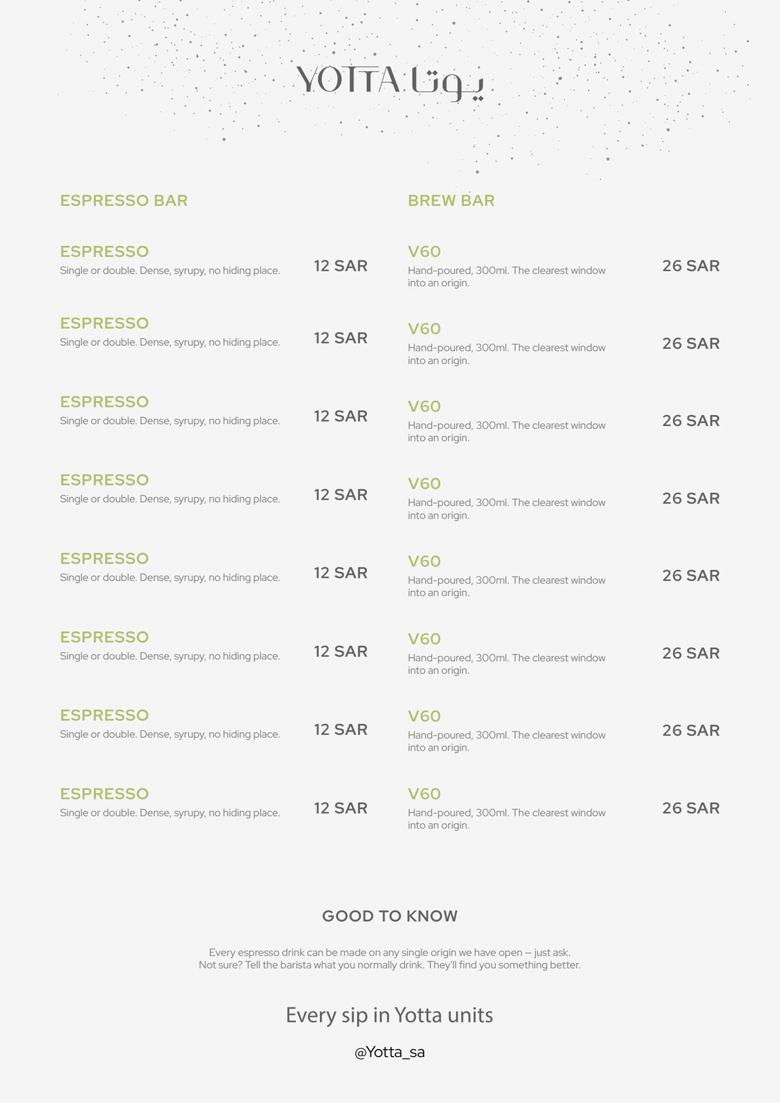
| Element | Specification |
|---|---|
| Format | A4 portrait, 18 mm margins, two columns, 10 mm gutter |
| Head | Lockup centred, speckle fading out by 25% of page height |
| Category | Label style, uppercase, 180 tracking |
| Item name | Medium 500, uppercase, Ink |
| Description | Regular 400, Graphite, Small |
| Price | Reading style, tabular figures, ranged right |
| Foot | Slogan, then the handle |
The category and item headings currently sit in Yotta Green on Off-White — 1.91:1, which fails accessibility. Reset all headings in Deep Olive #687435 before the next print run. Nothing else on the page changes.
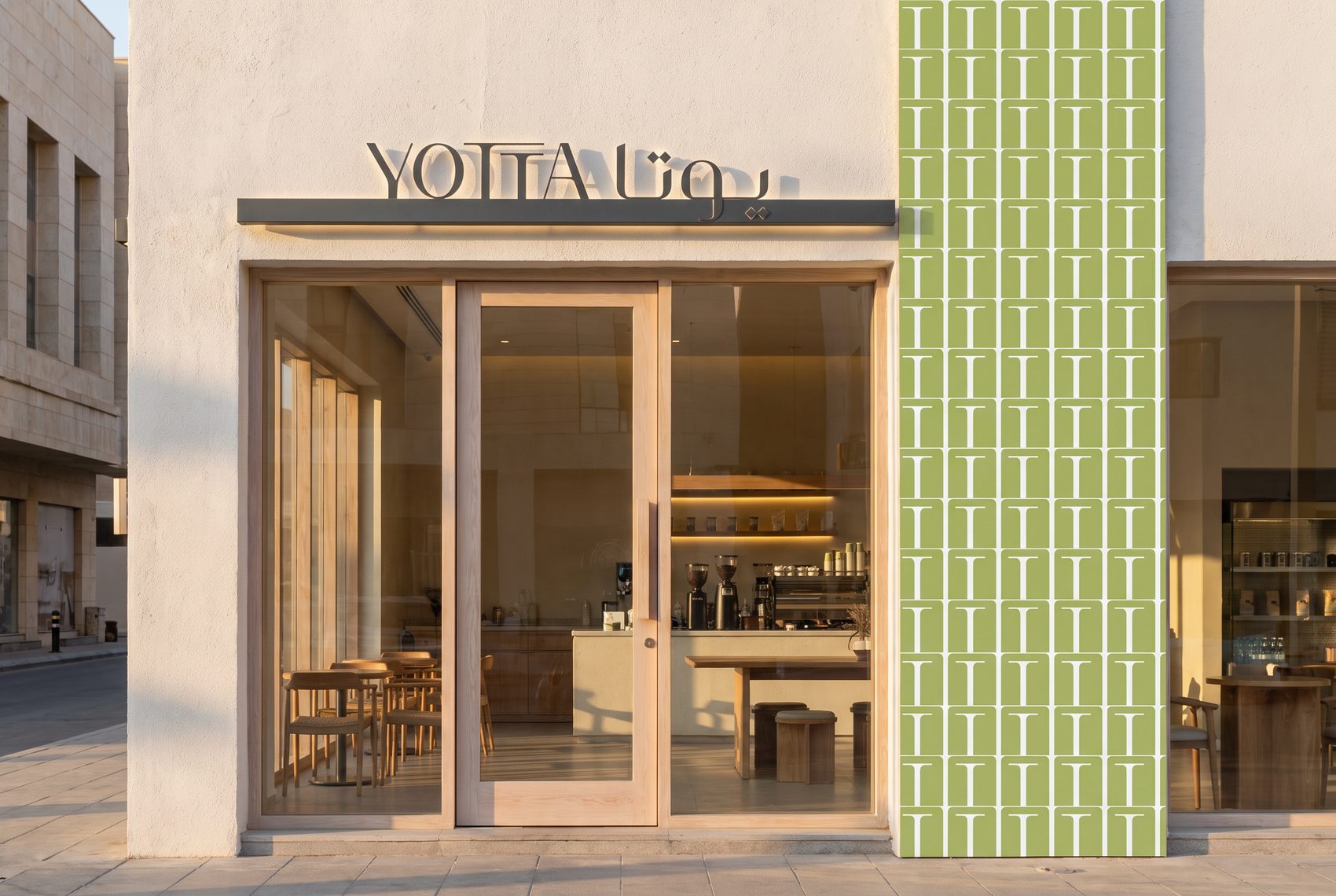
Fascia in Graphite on Off-White, halo-lit. The Unit Grid runs as a full-height vertical band at the entrance, Large scale, floor to head height. One green element per elevation — never two.
- Fascia: bilingual lockup, Graphite on Off-White, halo-lit. Never a green fascia.
- Unit Grid as a full-height vertical band at the entrance, Large scale, floor to head height.
- One green element per room — a bench, a wall, or the counter face. Never more.
- Materials: off-white plaster, pale timber, brushed stainless, unpolished stone.
- Wayfinding and menu boards: Ink on Off-White, Label style, 180 tracking.
- Uniform: Off-White or Graphite canvas apron, Latin-only mark embroidered at hem height, 40 mm wide, Heavy Reproduction artwork.
Staff greet with “What's your Yotta today?” The most repeated brand asset is spoken, not printed.
| Template | Content |
|---|---|
| The Reading | Product photo, code, three YU bars, price. No headline |
| The Statement | Plain ground, one line of copy at Display size, nothing else |
| The Unit Grid | Full green pattern panel, one oversized number in Off-White beside it |
- Handle @Yotta_sa appears once, bottom-left, Label size.
- No more than one green surface in any three consecutive grid posts.
- Captions: one line, no emoji, no hashtag stacks. Maximum two tags.
- Every campaign carries a number. A campaign without a reading is not a Yotta campaign.
| Example | Meaning |
|---|---|
| YOTTA_logo_bilingual_graphite_master.svg | Primary lockup, master artwork |
| YOTTA_logo_latin_offwhite_heavy.eps | Latin mark, heavy reproduction |
| YOTTA_pattern_unitgrid_white_master.svg | Unit Grid master tile |
| YOTTA_pack_1L_dieline_v3.pdf | Versioned dieline |
- 01_Logo · 02_Type · 03_Colour · 04_Patterns · 05_Templates · 06_Packaging · 07_Photography · 08_Guidelines
- Masters are versioned. Superseded files move to _Archive and are never deleted.
| Work | Approval needed |
|---|---|
| Social posts using existing templates | None |
| New product code & YU reading | Brand owner |
| Packaging artwork & print runs | Brand owner + production |
| Any new colour, typeface or pattern | Brand owner — written |
| Co-branding & partnerships | Brand owner — written |
Yotta Green is specified from production artwork as #AFBC69. Confirm the Pantone reference against a printed proof before the next run and record it here. Photography library and final mockups to be added in Volume 02.
Brand queries and asset requests: brand@yotta.sa · @Yotta_sa
Production & Print
The brand is extra-light, low-contrast and printed on rough stock. That combination is unforgiving. These pages exist so it survives the press.
- Substrates
- Print process
- Inks & colour
- Finishes
- Prepress
- Proofing & tolerances
- Regulatory
- Sustainability
- Schedule
Let the paper do the texture.
The speckle is a material, not a print effect. Specifying a genuinely speckled recycled board removes a colour from every run and makes the pack feel like the brand instead of imitating it.
Where the budget allows only one upgrade, spend it here. Better stock beats better printing on this identity every time.
| Item | Substrate | Weight |
|---|---|---|
| Bean box · drip box | FSC recycled uncoated folding boxboard, GD2 grey-back or speckled kraft-white | 350 gsm |
| 1 L carton | Liquid packaging board, uncoated outer, PE or bio-PE barrier inner | 255–300 gsm |
| Cups | Double-wall food-grade cupstock, water-based dispersion barrier, PE-free preferred | 300 + 250 gsm |
| Sleeve | E-flute corrugated, 100% recycled, uncoated both sides | ~340 gsm |
| Drip sachet | Kraft-look recyclable mono-material laminate, matt | — |
| Menu | Uncoated recycled offset, natural white | 170 gsm text · 300 gsm cover |
| Cards & stationery | Uncoated recycled, duplexed for cards | 120 / 600 gsm |
Avoid brilliant-white and heavily optically-brightened stock. Off-White #F5F7F7 is designed to sit on a warm-neutral sheet; on OBA-heavy paper it reads blue and the green shifts cold.
Two spot colours. Nothing more.
Every carton in the range can be printed in two spot inks. That is cheaper than CMYK, holds the extra-light wordmark far better, and guarantees the green is identical across suppliers.
Never build the wordmark or the Unit Grid from a four-colour process. Registration error on 0.2 mm strokes is visible at arm's length and makes the mark look broken.
| Item | Process | Colours |
|---|---|---|
| Cartons · run over 3,000 | Offset litho, sheet-fed | 2 spot — Green + Graphite |
| Cartons · run under 3,000 | Digital, HP Indigo 7-colour | Simulated spot, verified to ΔE ≤ 2 |
| 1 L carton | Flexo on web, or offset for premium runs | 2 spot + white base if needed |
| Cups | Flexo, food-safe | 2 spot |
| Sleeve | Flexo direct to E-flute | 1 spot — Green, knocked out white |
| Menu · stationery | Offset or digital | 2 spot |
| Signage | Fabricated letters, halo-lit; painted wall band | Matched to spot |
If the speckle must be printed rather than supplied by the stock, add it as a third ink — a 6–10% halftone of Graphite. Never simulate it in CMYK; the rosette pattern fights the flecks.
One green, verified on stock.
Yotta Green is the single most valuable visual asset in the system. It must be identical on a carton, a cup and a wall, which means specifying it as a spot ink and proving it on the actual substrate.
Pantone 2302 C is the nearest estimate derived from the supplied artwork. It has not been verified against a printed proof. Confirm before the first run and record the approved reference here.
| Colour | Spot | Process build | Use |
|---|---|---|---|
| Yotta Green | Pantone 2302 C · to confirm | C7 M0 Y44 K26 | Panels, patterns, plates |
| Graphite | Cool Gray 11 C | K80 — never a 4-colour grey | Wordmark, body text |
| Ink Black | Black C | K90 | Headlines, night surfaces |
| Deep Olive | Pantone 5757 C · to confirm | C10 M0 Y54 K55 | Green as text only |
- Working space Fogra 51 (coated) / Fogra 52 (uncoated). Supply artwork in the profile matching the stock.
- Total ink coverage maximum 280% on uncoated.
- On uncoated stock expect the green to drop 8–12% in saturation. Request the 2302 U reference for uncoated runs rather than accepting a dull C match.
- Tolerance: ΔE ≤ 2.0 for Yotta Green, ΔE ≤ 3.0 for all others.
Matt, or nothing at all.
The identity reads as considered because it is quiet. Gloss, foil and spot UV all pull it toward a luxury register the brand has explicitly rejected.
A blind deboss of the wordmark on the bean box front, 0.35 mm maximum depth, is approved. It is the only decorative finish in the system. Never combine it with any coating.
| Finish | Status | Notes |
|---|---|---|
| No coating | Preferred | Best match to the material story; requires a robust stock |
| Matt water-based dispersion | Approved | Use where scuff protection is needed; adds no sheen |
| Blind deboss · wordmark | Approved | 0.35 mm max, front panel only |
| Matt lamination | Avoid | Blocks recyclability; only if a barrier is unavoidable |
| Gloss varnish · UV | Prohibited | — |
| Spot UV | Prohibited | — |
| Foil · metallic ink | Prohibited | — |
| Embossing of the pattern | Prohibited | The Unit Grid is flat, always |
Cups and any food-contact surface take no decorative finish of any kind. Their only coating is the functional barrier.
Supply it right the first time.
Most damage to this identity happens between the studio and the plate. These are the artwork rules a printer needs, and the numbers to check a returned proof against.
Packaged Illustrator file, PDF/X-4 with fonts embedded and a second copy with type outlined, the dieline as a separate spot channel, and a flat JPEG visual for reference.
| Rule | Specification |
|---|---|
| Bleed | 3 mm cartons and cups · 5 mm large format |
| Safety margin | 5 mm from trim · 8 mm from any crease or fold |
| Dieline | Separate spot swatch named DIELINE, 100% magenta, set to overprint, non-printing |
| Images | 300 dpi at final size minimum. Logo and pattern vector only, never raster |
| Minimum type | 6.5 pt positive · 8 pt reversed out of green or ink |
| Minimum stroke | 0.25 mm positive · 0.35 mm reversed |
| Reversed wordmark | Use the Heavy Reproduction artwork below 25 mm wide |
| Barcode | EAN-13, 80% magnification minimum, dark bars on Off-White, full quiet zones. Never on green, never on the pattern |
| Overprint | Graphite text over green set to overprint; Off-White knocks out |
The wordmark is the test.
If the extra-light strokes are clean and the green matches, everything else on the sheet is fine. Judge every proof by the mark before looking at anything else.
Retain one signed press sheet per SKU as the physical standard. Every subsequent run is matched to that sheet, not to a screen and not to a new proof.
| Stage | Requirement |
|---|---|
| First run of any SKU | Wet proof on production stock with production inks. No exceptions |
| Repeat runs | Contract proof to Fogra 51/52 plus the retained signed sheet |
| Press check | Attend the first 500 sheets of any new SKU |
| Measure | Tolerance |
|---|---|
| Yotta Green | ΔE ≤ 2.0 against the approved draw-down |
| All other colours | ΔE ≤ 3.0 |
| Registration | ±0.2 mm — checked on the wordmark, not on a target |
| Die-cut to print | ±0.5 mm |
| Crease position | ±0.5 mm |
| Pattern alignment across panels | Not required — the Unit Grid bleeds and is not matched across folds |
Arabic is not optional.
Saudi consumer packaging carries mandatory information in Arabic. Design for it from the start — retrofitting a legal panel is what ruins otherwise good packs.
This is a design brief, not legal advice. Confirm the current SFDA labelling requirements with a regulatory consultant before committing any run.
| Element | Placement |
|---|---|
| Product name · Arabic and English | Front panel |
| Net content | Front panel, top right, with the code |
| Ingredients · Arabic | Base or back panel |
| Production and expiry dates | Base panel, over-printed inline |
| Storage conditions | Base panel |
| Producer / importer name and address | Base panel |
| Country of origin | Base panel |
| Barcode | Base panel, Off-White ground |
- Graphite on Off-White. Never green, never reversed.
- Arabic set in Vazirmatn Regular 400 at legal-panel sizes — ExtraLight is not legible at 6.5 pt.
- Ink migration: low-migration EuPIA-compliant inks on all food-contact packaging.
Recyclable, or explain why not.
The material story is doing real brand work here. A laminated, mixed-material pack undermines the recycled board it is printed on, and customers notice.
Print only claims that are certified. No unsupported wording such as eco-friendly, green or natural anywhere on pack. The tone-of-voice rules apply to sustainability language too.
- Certification: FSC or PEFC on every paper item. Mark on the base panel, Graphite, 6.5 pt minimum.
- Mono-material: avoid laminates and mixed barriers wherever a dispersion coating will do the job.
- Inks: vegetable or soy-based, low-migration, water-based on corrugated.
- Adhesives: water-based and repulpable — not hot-melt on recyclable board.
- Coverage: the design already leaves 70% of every surface as bare stock. Keep it that way; it is the cheapest and greenest decision in the system.
- Cups: specify PE-free water-based barrier cupstock where a certified supply exists locally.
- Transit: unprinted recycled outer cases. No brand printing on shippers.
Where a compromise is unavoidable — a barrier film on the drip sachet, for example — document it and revisit at the next reorder rather than quietly normalising it.
One line per item.
The whole range at a glance — what it is made of, how it prints and what finish it carries. Hand this page to a printer with the artwork.
Minimum order quantities and lead times vary by supplier. Establish them once, record them against this table, and reorder to the retained signed sheet.
| Item | Size | Stock | Finish | |
|---|---|---|---|---|
| Bean box | 140 × 160 × 64 mm | 350 gsm recycled uncoated | 2 spot litho | None + blind deboss |
| Drip box | 100 × 120 × 55 mm | 350 gsm recycled uncoated | 2 spot litho | None |
| 1 L carton | 310 × 370 × 170 mm sheet | 255–300 gsm LPB | 2 spot flexo | Barrier only |
| Cup 4 oz | 118 ml | Double-wall cupstock | 2 spot flexo | Barrier only |
| Cup 7 oz | 207 ml | Double-wall cupstock | 2 spot flexo | Barrier only |
| Cup 8 oz | 236 ml | Double-wall cupstock | 2 spot flexo | Barrier only |
| Cup 12 oz | 354 ml | Double-wall cupstock | 2 spot flexo | Barrier only |
| Sleeve | 12 oz | E-flute recycled | 1 spot flexo | None |
| Drip sachet | 10 g | Mono-material laminate | 1 spot | Matt |
| Menu | A4 | 170 gsm uncoated recycled | 2 spot | None |